Home Page #
This guide provides an overview of the main interface, designed to assist you in navigating and utilizing the various features efficiently. Below, you will find descriptions of each primary section within the system.
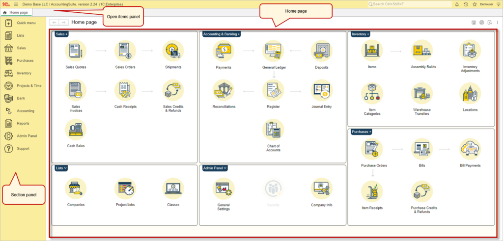
Home page contain key commands from the sections. It includes navigation commands that allow you to go to particular forms, such as a list form.
The open items panel allows you to quickly switch between previously opened sections and files of the program. Panel tabs are arranged by their opening time, and new tabs are added to the end. Clicking a tab activates a form. You can drag the tabs to reorder them for your convenience.
The section panel serves as a quick access menu for various functional areas of the software, grouped under icons. Each icon represents a different aspect of the business operations.
- Quick menu: Quick access to create any list item or document.
- Lists: Offers menu links to manage lists like companies and projects.
- Sales: Access sales-related functions such as quotes, orders, and invoices.
- Purchases: Navigate to purchase orders, bills, and related transactions.
- Inventory: For managing stock, items, and inventory adjustments.
- Projects & Time: Tools for managing projects and tracking time.
- Bank: Access bank transactions and reconciliations.
- Accounting: Direct access to accounting functions like ledger entries and financial reports.
- Reports: A section to generate various business reports.
- Admin Panel: Contains settings for general configuration, security, and company information.
- Support: Provides access to help and customer support resources.
For more information on the available features, please refer to the relevant section of the documentation.
After you click on any section from the section panel, a new panel will open. This is the navigation panel. Here, you will see links to all documents, lists, reports, tools, and settings related to this section of AccountingSuite.
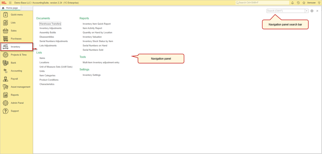
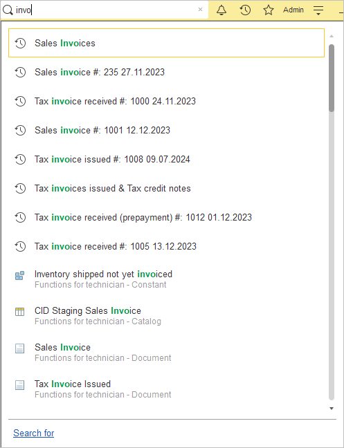
The navigation panel also includes a search bar, which allows you to easily find a link to any object from any section. The search results are sorted by section.
Tools panel #
A closer look at Tools panel.
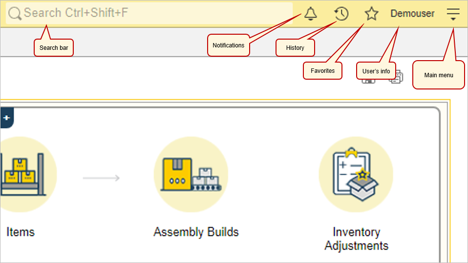
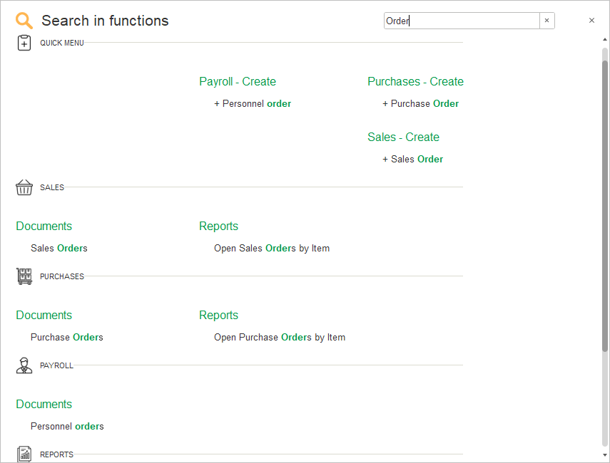
Search bar. In the tools panel, there is another search bar. However, this search bar is much more powerful than the one in the navigation panel. Using this search bar, you can find not only links to documents and lists but also individual records within those lists and documents, simplifying your work in the system when handling large amounts of data.
Notifications is a place for all your messages.
History grants users a log of previously opened items (except for the home page).
Favorites is a user-created list of links used for quick access to specific configuration sections, InfoBase object forms, reports, or data processors.
User’s info provide users with a log of previously opened items.
Main menu #
The Main menu is a summary of the commands. You can refer to the settings of main menu using the ![]() button located in the upper-right corner of the window. The main menu includes commands to customize the home page, sections panel.
button located in the upper-right corner of the window. The main menu includes commands to customize the home page, sections panel.
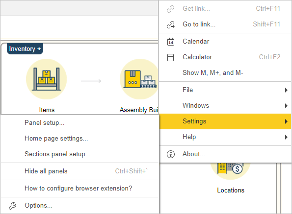
AccountingSuite features a built-in calendar.
AccountingSuite has a built-in calculator.
File provides users with a tools to open files from their PCs or create new text or spreadsheet document.
Windows is an equivalent to the open items panel. Windows feature can help if you have too many opened tabs, as it allows you to see all your tabs as a list.
Objects list #
Header #
Every tab in AccountigSuite has following buttons in its header.

To return to the previous active form, click Back. To navigate to a form you returned from, click Forward. This button is only available when you’ve recently returned from a form. To add a form to the list of favorites or remove it from the list, click the star icon (a yellow star indicates that the form is in the list of favorites).
The Window settings button opens up a menu with tools to help you customize windows for your liking. You can dock windows in any part of the screen with the Dock functions. Also, you can open two forms at the same time by using Side by side tool. Last but not least you can change the scale of the window.
Action bar #
A form action bar includes the commands that are directly related to the object displayed in the main form. The commands are displayed as buttons.

Action bar is located right under the header. To the different type of form, there can be applied different actions. There is a list of the most common actions. For additional actions related for a specific task see the More actions menu on the left side of action bar.
| Action | Description | Icon |
|---|---|---|
| Create | When clicked, it opens a drop-down menu consisting of the next two commands | |
| Copy | Creates a new document, a new line to a document, a new item to a list based on existing one. Can be used by F9 hot key. | |
| New | Creates a new document, a new line to a document, a new record to o a list. Can be used by Ins hot key. | |
| Export list | Allows you to download the list in a file format convenient for you. File formats are: PDF, XLS, XLSX, DOCX, TXT, ODS, HTML. | |
| Columns | Opens a drop-down menu, which allows to you hide or show any column. | |
| Move current column left | This button allows user to move picked column on the left. | |
| Move current column right | This button allows user to move picked column on the right. | |
| Refresh | Refreshes current list. Can be used by F5 key | |
| Edit | Allows user to edit selected item from the list. Accessible through the More actions menu or F2 key. Also, you can edit selected item by double-clicking it. | |
| Delete | Deletes selected item. Accessible through the More actions menu -> Edit drop-down menu or Shift+Delete key combination. |
Search bar helps to search in a list, start typing the search query. As a result, the list is filtered to show only lines that contain the search string, and the matches are marked with color. You can also switch to the search box by pressing Alt+1.
More actions menu commands in Objects list #
Settings #
Data display, row sorting, list grouping, and list formatting in the table can be configured in the List Settings dialog. Access this dialog form by selecting More Actions – Settings – Configure List.
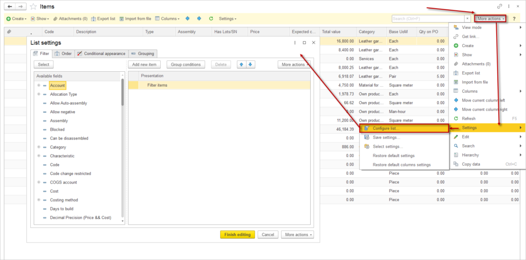
In this form, you can configure:
- data filtering in the list;
- sorting fields;
- conditional formatting of the list;
- fields to group data by.
Settings are organized into tabs: Filter, Order, Conditional appearance, and Grouping. To apply a setting, set its value on the respective tab.
A setting is applied to the list if the “use” checkbox next to it is enabled. You can arrange the order of settings within each configuration.
To reset list settings to default, select More Actions – Settings – Restore Default Settings.
To accept the settings, click Finish Editing. Settings are saved between sessions.
To save a set of settings for the list form, select More Actions – Settings – Save Settings…. Enter a name in the dialog form that opens and click Save.
To use previously saved list settings, select More Actions –Settings – Select Settings. In the dialog form that opens, select the desired setting from the list and click Select.
Filter #
To set up filtering in the list, go to the Filter tab in the List Settings form and add filter elements.
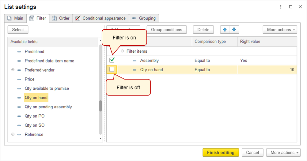
To add a filter, click on desired element and click Select or drag a field from the Available Fields list. Select the Comparison Type from the pop-up menu in the Comparison Type column.
If you select comparison types like In List, In Group from List, Not in List, or Not in Group from List, multiple values can be chosen.
If needed, adjust the order of filter conditions in the list using the Move Up and Move Down buttons on the command panel.
To apply the filter setting to the list, click Finish Editing.
With using filter you can add to the documents list period filter. Use Group condition button with AND group to one field with date twice with Greater than or equal to and Less than or equal to in Comparison type column.
This example shows how to add Invoice date period filter (from-to) into Sales Invoice documents list.

Order #
To configure sorting in the list, go to the Order tab, select a sorting option, or enable the checkbox next to an existing sort field.
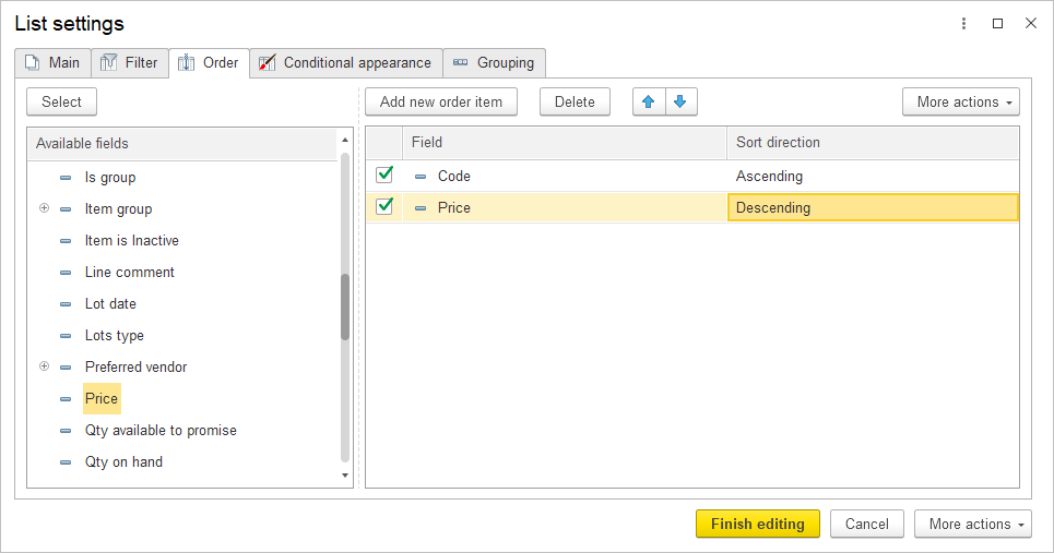
To add a sort field, click on desired element and click Select or drag a field from the Available Fields list and choose Sort Direction (Ascending/Descending).
If needed, reorder sorting fields using the Move Up and Move Down buttons.
If there are multiple sort fields, data will first be sorted by the first field, then the second, and so on.
To apply sorting settings to the list, click Finish Editing.
Conditional Appearance #
To configure conditional formatting, go to the Conditional Appearance tab in the settings dialog and add elements as needed.
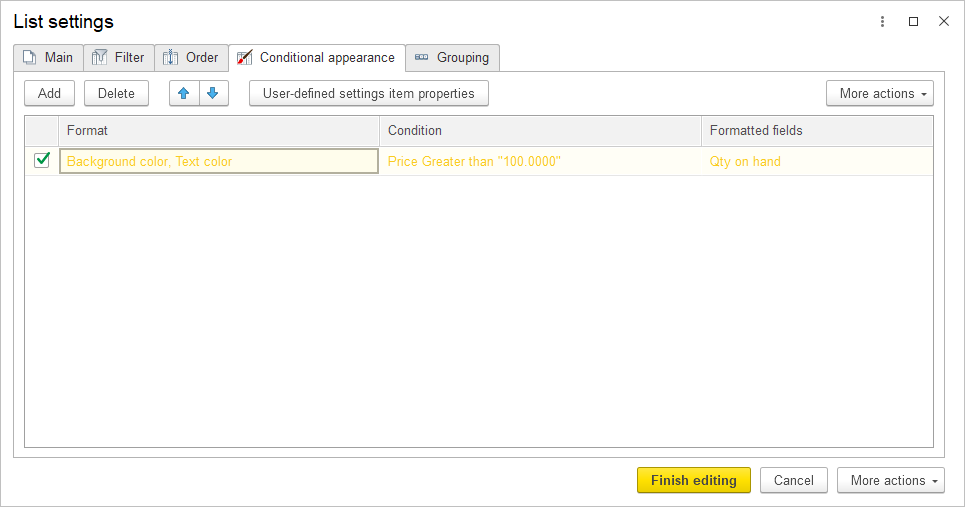
To create a conditional formatting element, click Add. Edit the formatting in a separate window:
- On the Appearance tab, select the formatting parameters, such as background color, text color, etc.
- On the Condition tab, set the condition for applying formatting. Conditions are set similarly to filters.
- On the Formatted fields tab, select fields to apply the formatting to when the condition is met.
Reorder formatting elements using the Move Up and Move Down commands if necessary.
The order of formatting elements determines the sequence in which formatting is applied. If two conditions apply to one column, the last formatting from the conditional formatting list is applied.
To apply conditional formatting, click OK.
Grouping #
To group records in the list, go to the Grouping tab in the settings dialog and add the field by which you wish to group data. If multiple fields are selected, records are grouped sequentially in the specified field order.
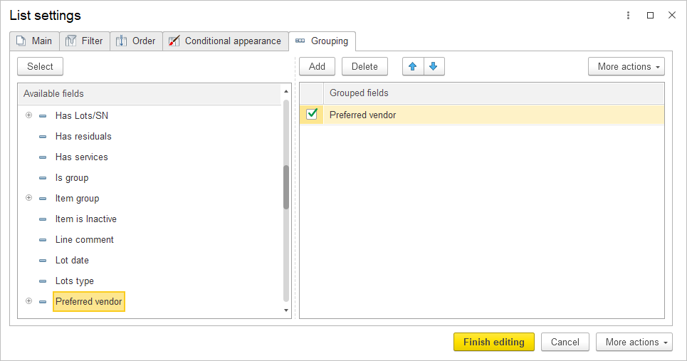
To apply grouping, click Finish Editing.
Columns #
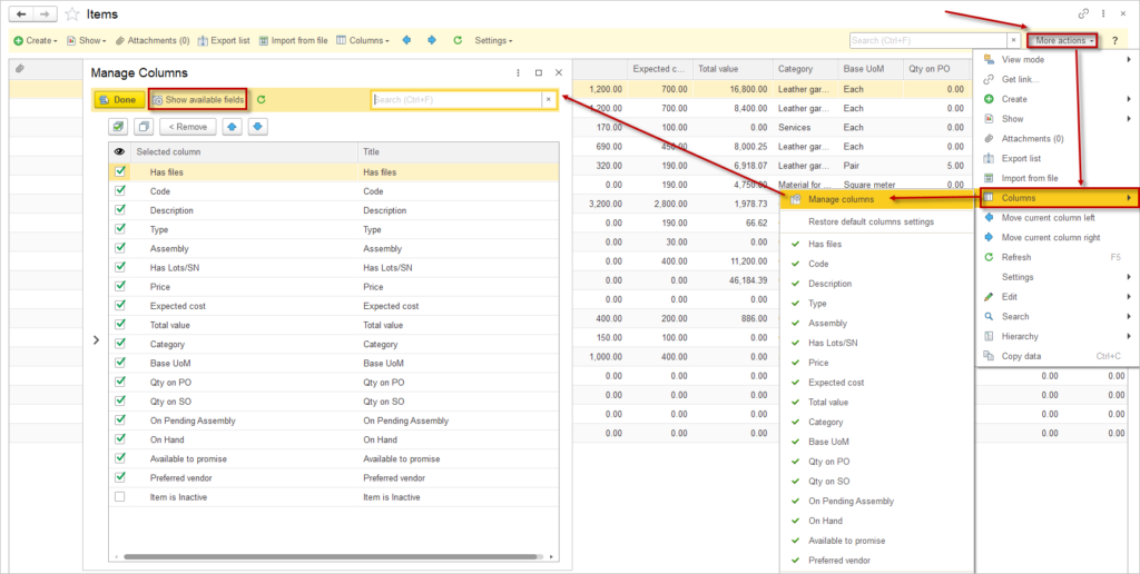
To display all available columns for a list, use the More actions menu command – Columns.
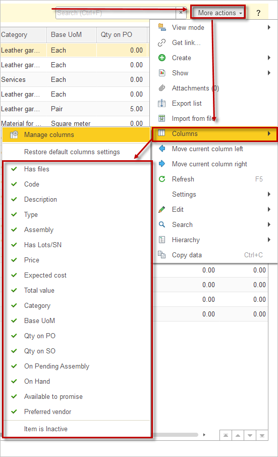
To display a column, double-click on it.
To view the list of all available columns, click the Manage columns button. In the form that opens, click Show available fields.
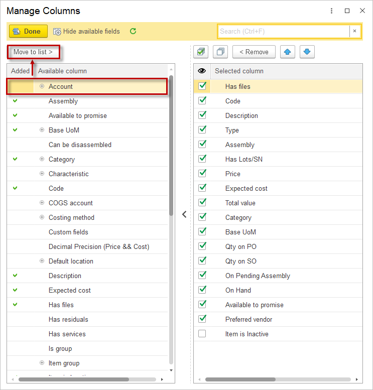
In the Available Column list, select the desired column and click Move to list.
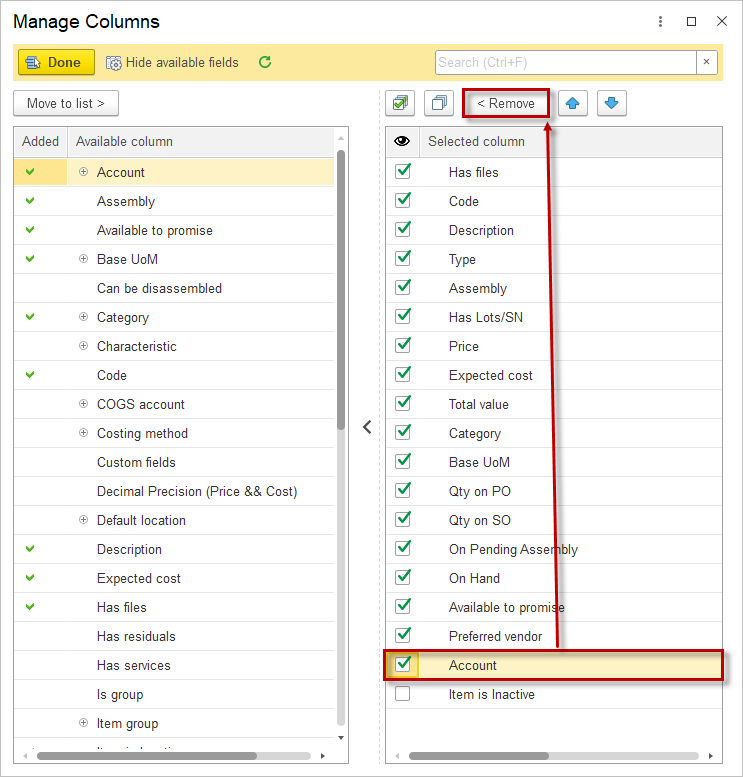
To remove a column, select it in the Selected column field and click the Remove button.
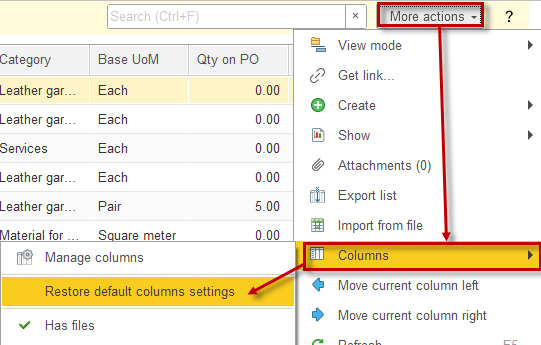
To restore the default list view, go to Columns – Restore Default Column Settings.
Export list #
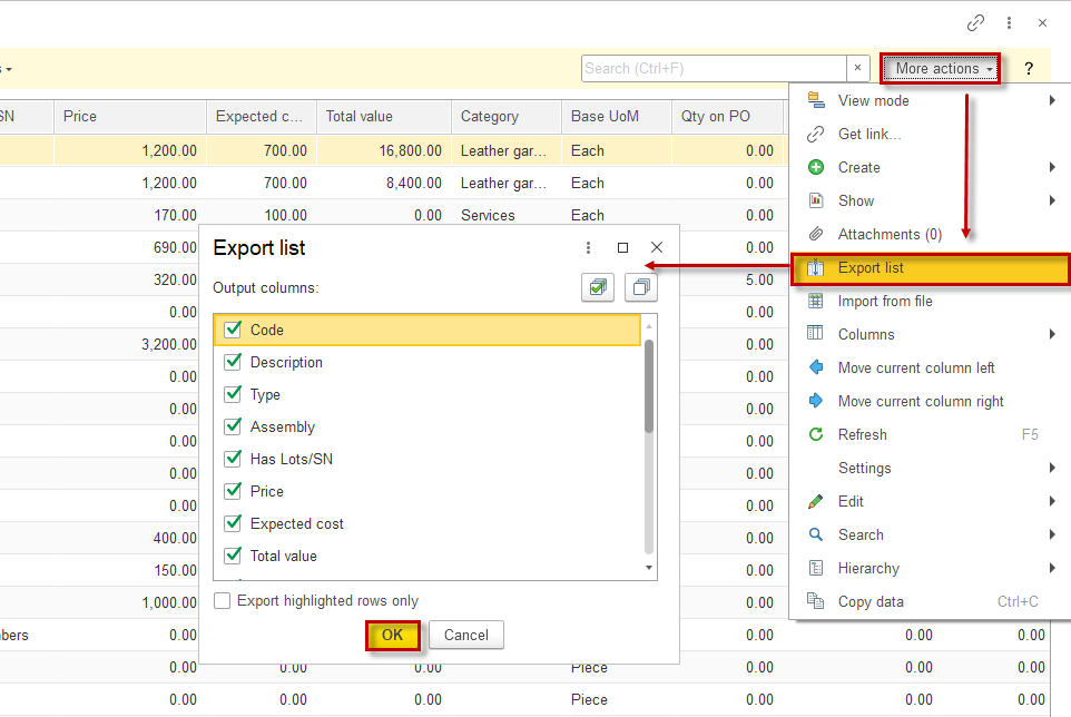
To export a list to a text or spreadsheet document, select More actions – Export List.
In the dialog form that appears, choose the required columns and click OK.
In the new tab, you can adjust the page layout (orientation, margins print colors), save it to your computer in desired format or email it.
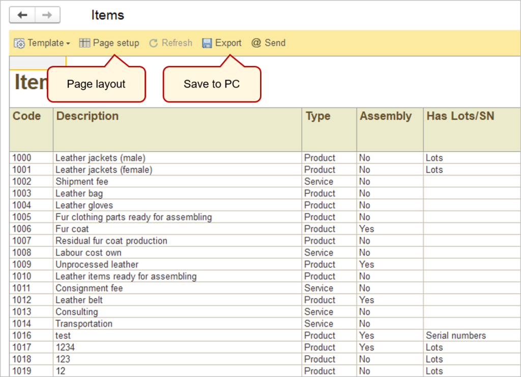
Available formats:
- Adobe PDF (.pdf)
- Excel 2007 (.xlsx)
- Excel 97-2003 (.xls)
- Electronic open Table Document (.ods)
- Word 2007 (.docx)
- Web-page (.html)
- Text documnet UTF-8 (.txt)
Work area #
Now we move to the work area.
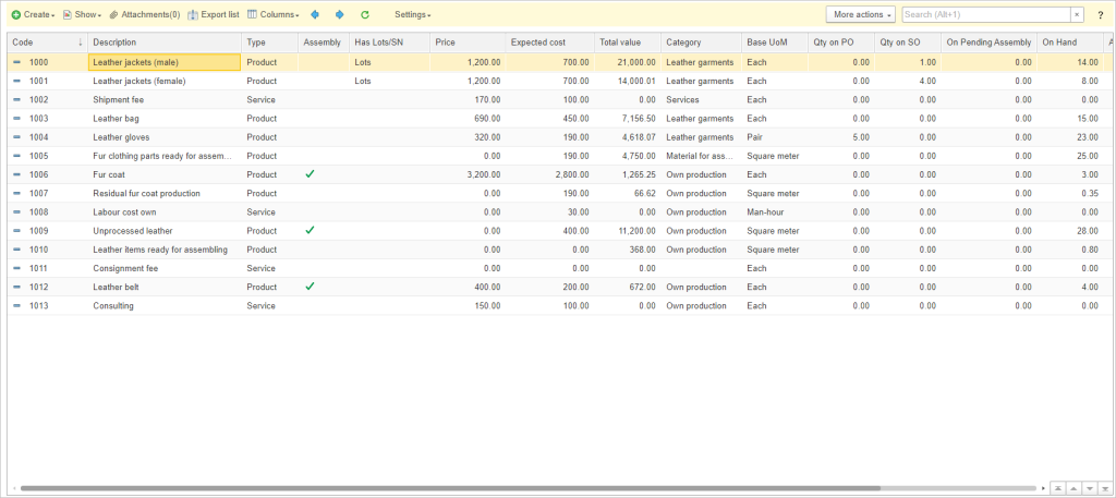
The work area shows the list of items and all the main information. The list can be sorted by left-clicking on the column name, second click on the same name will oppositely order the list. If the column consists of words it will be sorted in alphabetic order, if there are numbers, it will be arranged in numerical order. By default, the list is ordered by the first column.
List view mode #
In AccountingSuite, certain lists support working with hierarchical lists. A hierarchical list has the following display modes: hierarchical list, list, and tree. You can switch modes through the More actions menu – Hierarchy – Hierarchy . The selected view mode is displayed with a highlighted icon.
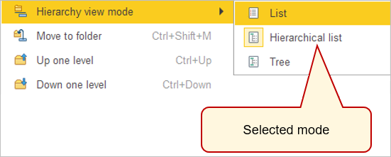
List Mode: When the List mode is selected, all items in the list are displayed in the form, with groups and items shown in an alphabetical order.
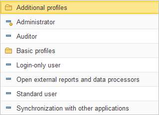
Hierarchical List Mode: For lists with group and item hierarchies, the Hierarchical List mode displays only top-level items. Once you enter a group, only items belonging to that group are displayed.
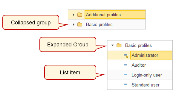
- Collapsed Group – The row represents a group of items. Clicking the left mouse button on this icon expands the group, allowing access to its items.
- Expanded Group – The row displays the name of the open group, always positioned at the top of the table, below the list’s column headers. Clicking the left mouse button on the icon in the row closes the group.
- List Item – The row represents an individual list item.
Tree Mode: In Tree mode, list items are displayed as a tree structure.
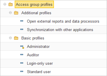
For ease of navigation, the tree can expand and collapse. The + (plus) sign in a branch node indicates that the branch can be expanded. Clicking the left mouse button on this sign opens the next level, changing the + (plus) sign to a – (minus). To collapse a branch, click on the – (minus) sign.
To quickly move to the beginning or end of the list, use the Home and End keys, respectively.
Now let’s dive into creating a form.
Object form #
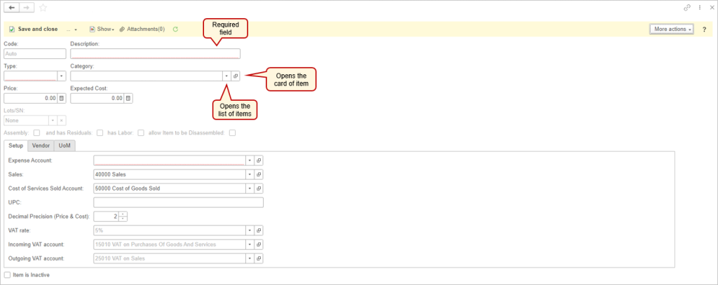
Required fields are the fileds marked with the red dots. You can not save without filling these fields.
Grey semi-transparent text shows what information will be filled in the field if no input is given. The Auto means the field will be filled using the auto-numbering setting.
The ![]() button opens the list of items related to the current field. You can start typing a string into the field, and it will automatically provide relevant suggestions based on the input.
button opens the list of items related to the current field. You can start typing a string into the field, and it will automatically provide relevant suggestions based on the input.
If a similar type of document has been filled out before, the list will display previously used items.
For example, in the demo base, we already have created several instances of Items. When we create a new Item, in the Category field, we will see the next suggested elements.
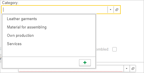
If the field has never been filled in, menu will look like this:
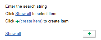
You can click Show All to display the complete list of available items. In the opened window you can take a look at more specific details, rather than just a name of an item. This window provides enhanced search and sorting tools.
Also, you can create a new item by clicking ![]() button or by pressing F8 key. This feature grants you the ability to make new items without having a need to navigate away from the current form. This minimizes the time and effort required to perform repetitive tasks, thereby improving overall productivity
button or by pressing F8 key. This feature grants you the ability to make new items without having a need to navigate away from the current form. This minimizes the time and effort required to perform repetitive tasks, thereby improving overall productivity
You can press the ![]() button, it will open card of selected item in the new tab (drill-down to the item or document).
button, it will open card of selected item in the new tab (drill-down to the item or document).
More actions menu commands in Object form #
Copy #
The Copy command allows you to create an identical copy of a document. This command is useful for creating multiple documents when only one minor field needs to be changed. Instead of re-entering all fields, you can create a copy and simply adjust the needed field.
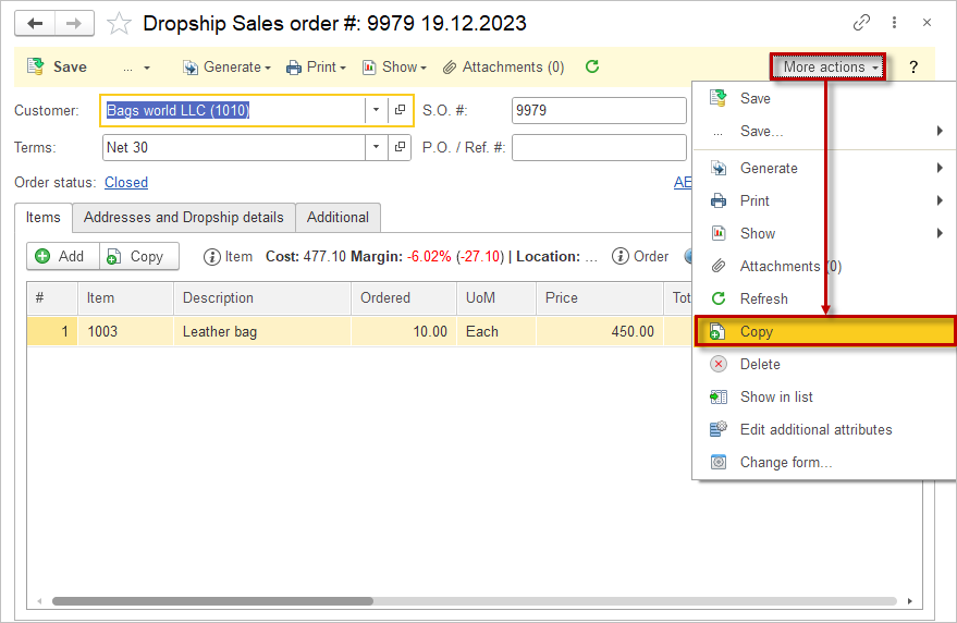
Delete #
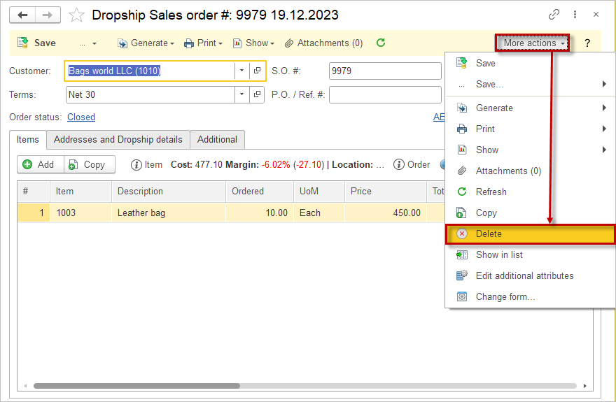
The Delete command allows you to remove documents from the list. The document must be reverted to draft status and have no dependent documents.
Show in list #
The Show in list command shows where and in which object list the current object is located. This command is useful when you access an object via a direct link or from a related document.
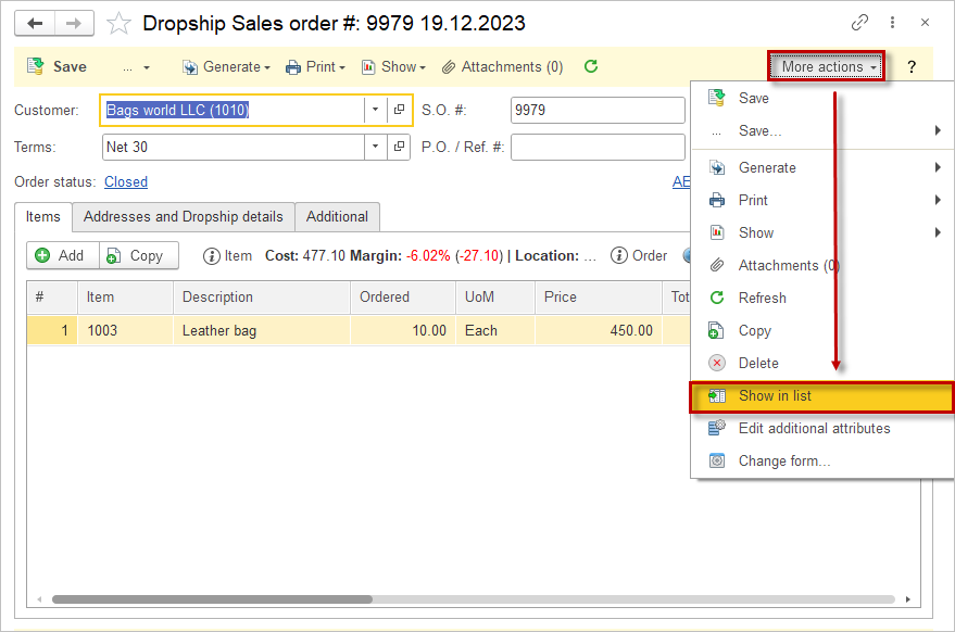
Edit additional attributes #
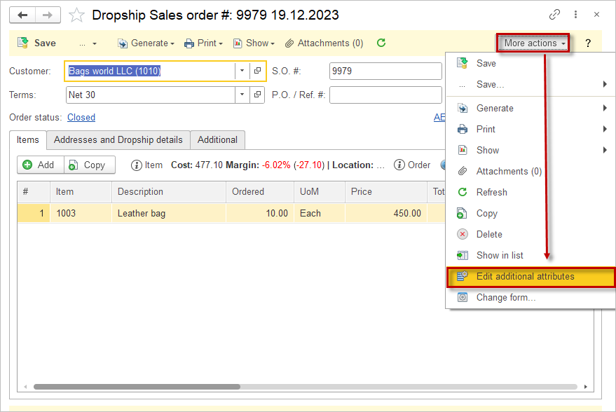
The Additional Attributes allows to add Custom Field to the document or list items.
Additional Attributes Form consists of two parts:
- On the left side are sets of properties assigned to the list or document, displayed as groups.
- On the right side, a table displays the list of attributes within the selected set.
The table has two columns:
- Name – the name of the additional attribute.
- Value Type – the type of additional attribute. For additional attributes of type Additional Value and Additional Value (Hierarchy), the first three values are listed.
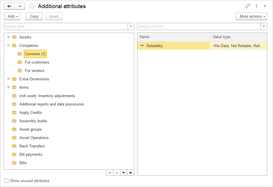
The list of additional attributes is grouped by sets, which relate to various objects in the program (lists, documents, etc.).
Entering New Additional Attributes #
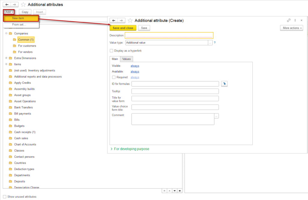
Fill in the following fields:
- Description: Enter the property name.
- Value Type: Select the value type of the property using the button.
- Visible: Click the link in this field to set the visibility of the additional attribute. The visibility can depend on certain conditions (e.g., the completion of another attribute). Once a condition is set, it is displayed in the link. By default, it shows Always. This option applies only to additional attributes.
- Available: Click the link in this field to set the accessibility of the additional attribute for editing. Accessibility can depend on certain conditions (e.g., the completion of another attribute). Once a condition is set, it is displayed in the link. By default, it shows Always. This option applies only to additional attributes.
- ID for Formulas: This field is filled in automatically. If it is not, you can press the button to generate it. This field can be used in formula construction, independent of the application user’s language.
- Tooltip: Enter text to explain how the property should be filled. This text will display on-screen when hovering over the additional attribute during input.
- Comment: Enter a description to provide clarification when selecting additional attributes (information) within sets.
- In the For Developing purpose section, the Name field is filled in by the application automatically. It is not recommended to edit this field manually.
Fields available only for additional attributes:
- Display as a Hyperlink: To add links to external resources or other application documents and lists (e.g., files) on the document card or list item, check this box. Available for string-type additional attributes and reference objects (clicking the hyperlink for the latter opens the document card or list item).
- Required: Check this box to ensure the additional attribute cannot be left blank when filling out lists or documents. This can also depend on certain conditions (e.g., the completion of another attribute). To set a condition, click the link, which defaults to Always.
Change form #
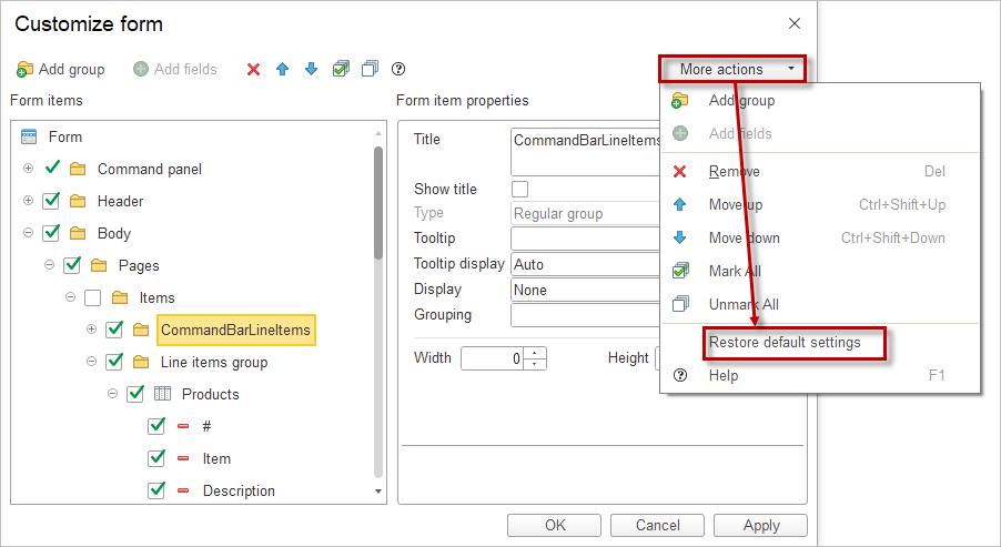
When you select More actions – Change Form on the object’s command panel, the form editor window opens.
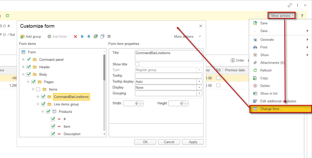
The left side of the window displays the structure of form elements as a tree. The right side shows the properties list of the selected form element.
The form’s content and appearance are defined by a set of elements, which can include:
- groups,
- tables,
- fields,
- buttons.
These elements have properties that affect how they are displayed on the form. The hierarchical organization of elements determines their layout on the form.
The user can change the composition, layout, grouping, and properties of elements.
Reordering Elements: To change the position of elements in the hierarchy, use the Up and Down buttons or drag the element to the desired location with the mouse.
Element Properties: Properties for each element are configured in the element’s properties section. A description of each property is displayed at the bottom of the panel when selecting a property.
Visibility Settings: To change the visibility of elements on the form (hide or show), use the checkboxes next to each element. Note that you cannot manage the visibility of the root element Form or the form settings button. Additionally, the visibility of the command panel containing the Change Form button cannot be modified.
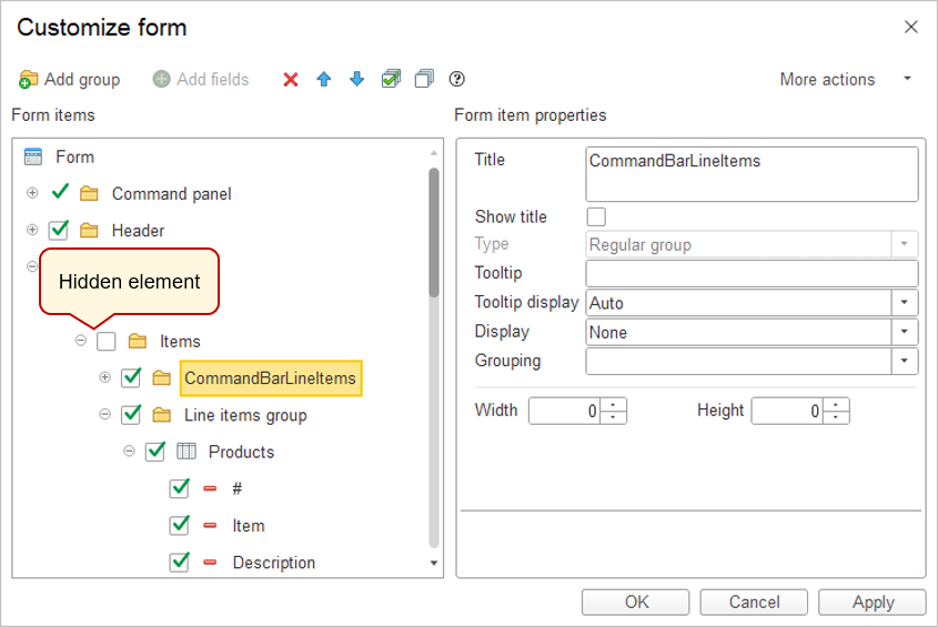
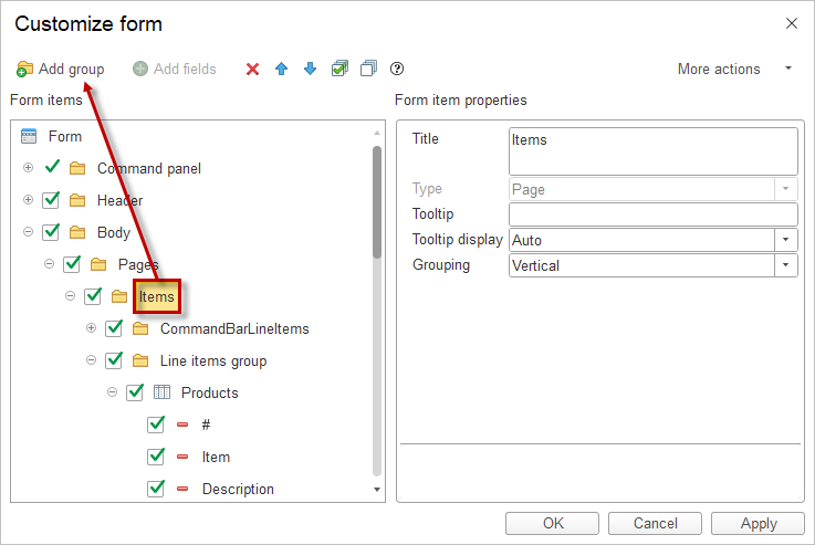
Creating Groups: To add a group to the form, select the desired element in the structure tree and click the Add Group button.
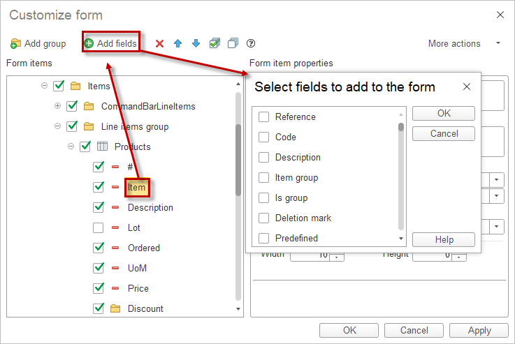
Adding Fields: For some fields, an Add Fields button may be available, indicating that the data displayed in the field/column has attributes that can also be displayed in the field/column. To add field attributes to the form, select the form element, click Add Fields, and in the window that opens, choose the required attributes.
Applying Settings: Settings are applied when you exit the editor using the OK button or by selecting the Apply command. The settings are saved in the information database so that they can be reused when the form is reopened.
During customization, you can revert changes made either in the current session or previously and restore the form settings specified in the configuration. To do this, use the Set Default Settings command in the More actions menu. This command does not immediately change the form. After executing it, you can continue customization. Settings are only applied when you press OK or Apply.
Saving #
In AccountingSuite there are several ways how you can save objects.
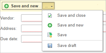
- Save and close. The object you edited will be taken into accounting. It can affect data and be used in other documents, catalogs, and reports. Editing will stop and form will close.
- Save and new. Same as the previous one, but will open up a new blank form of a saved object.
- Save. The object will be taken into account. The editing form will not close.
- Save as draft. The object will not take part in accounting. It can not affect and be used in other documents, catalogs, and reports.
The program will remember your previous selection until you make a new one. This feature is particularly useful in scenarios involving the mass creation of documents.
Report form #
1
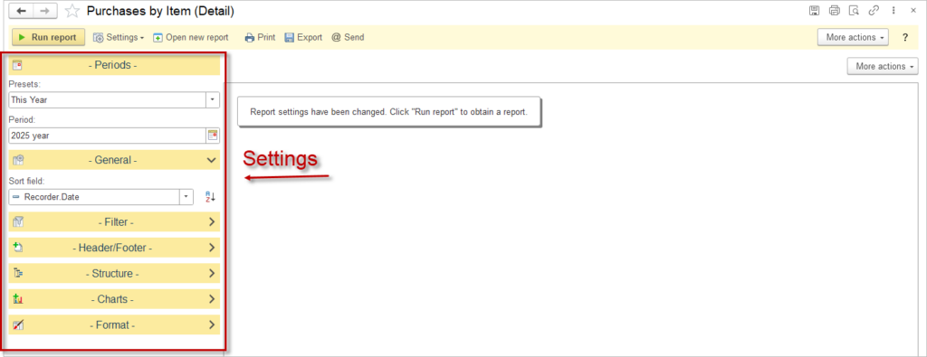
Saving report settings #
Settings are located on the left part of the work area. They allow you to create a report with only the parameters you need.
All settings can be saved by clicking the ![]() button and choosing Save settings in opened menu. After that you can apply these settings to a different report. To do that you need to click on Select saved settings and then choose desired one.
button and choosing Save settings in opened menu. After that you can apply these settings to a different report. To do that you need to click on Select saved settings and then choose desired one.
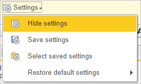
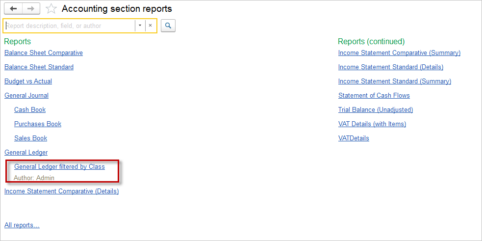
After the setting have been saved, the report becomes visible as a separate menu item under the Reports section.
Period selection #
Period settings will help you to set the period you reporting. You can choose any time period you want for your report. Press the ![]() button and the following menu will open up:
button and the following menu will open up:
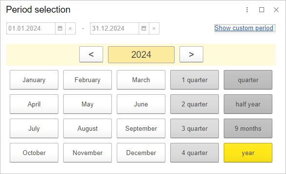
Here you can select from predefined periods or create your own custom period by clicking Show custom period, allowing you to work with various dates.
General settings #
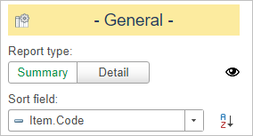
Generel settings allow you to change type of the report and sort field.
Filters #
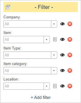
Filters provide you with a sorting tool that leaves only the information you need. There are premade filters for most of the reports, but you can always make a custom filter for your needs
Header and footer #
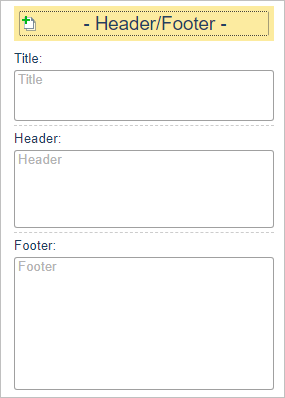
Header and footer allow you to change title, header and footer of your report
Structure #
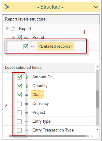
Structure allows users to easily customize report columns and report details from the report’s default options by:
- selecting the required structure levels;
- moving the structure levels up and down;
- selecting the required fields.
Select the <Detailed records>(1) then check additional columns (2).
Charts #
Charts let you add line graphs, bar chart, or pie charts to your report.

Format #
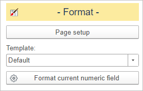
Format helps you setup your report. You can change scale, format of the page (A4, A5 and many more), make your report black and white or color.
The Export button ![]() from the action bar allows you to save your report locally on your device in a convenient file format (PDF, XLS, XLSX, DOCX, TXT, ODS, HTML).
from the action bar allows you to save your report locally on your device in a convenient file format (PDF, XLS, XLSX, DOCX, TXT, ODS, HTML).
The Send ![]() command provide very useful tool, which will help you send reports via emails.
command provide very useful tool, which will help you send reports via emails.
Tools for editing provide you with a great deal of functions. You can add drawings to your report, add comments, change font and highlight of the text, allign it any way you want and many other commands to make your editing easy and quick.
Changing Language #
AccountingSuite is available in multiple languages.
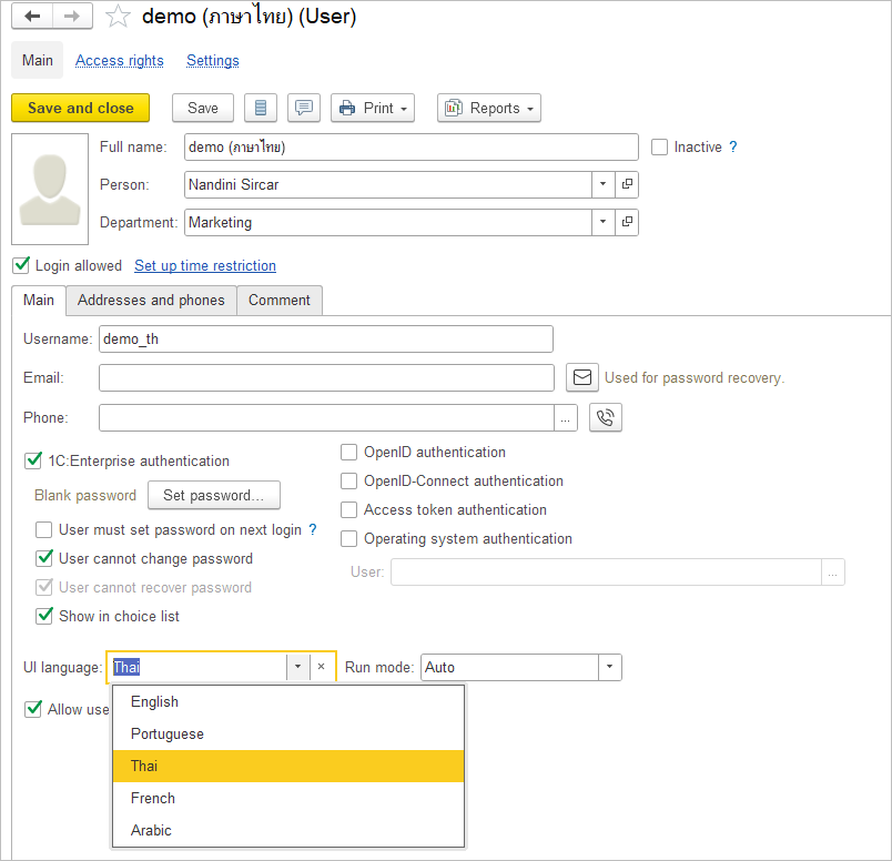
Set up user language in Admin Panel – Security settings – Users. Open user record and select UI language.
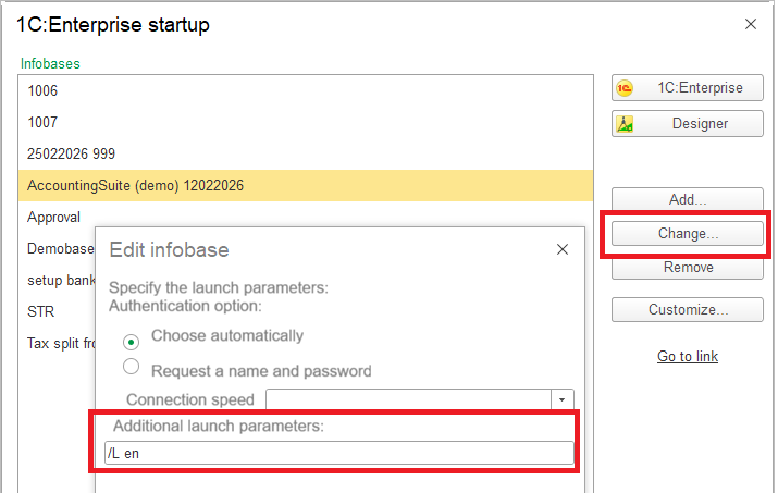
The language of the 1C Platform will be by browser default language and Windows language automatically. To change the language, select Change before launching the database. In the Additional launch parameters, specify the setting. The key /L sets the platform interface language, while the key/VL sets the localization for time, dates, and units of measurement.
Enter /L en or /VL en for English, /L fr or /VL fr for French, /L ar or /VL ar for Arabic, /L pt or /VL pt for Portuguese.
AccountingSuite cloud automatically adopts your browser’s language settings. To customize content display language, access your browser preferences directly and select the desired language option to the first position.
