In the AccountingSuite system, Dashboards as a central tool for visually presenting key business data in real time. Their primary purpose is to provide fast, clear, and effective monitoring of all critical performance indicators, enabling timely insights and supporting decision-making across all levels of the organization.
Each Dashboard is designed to consolidate relevant metrics and display them using intuitive visual elements such as charts, graphs, KPI indicators, and tables. This approach transforms complex datasets into actionable insights and allows users to quickly identify trends, anomalies, and areas requiring attention.
Dashboards are available across multiple modules, each offering a tailored view of specific operational and financial dimensions. For example:
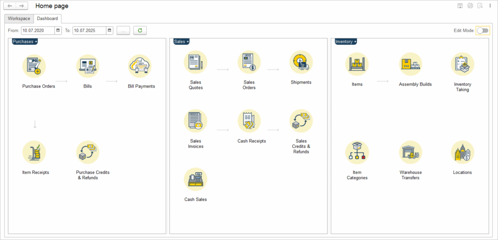
- Sales: Displays reports such as sales by customer, by item, by representative, sales orders by item, dropship sales, and AR aging.
- Purchases: Includes reports such as AP aging and purchases by vendor.
- Inventory: Offers visibility into inventory valuation, item costing, stock levels by location, serial numbers sold, and inventory stock status.
- Accounting: Provides access to key financial reports such as the income statement (standard and comparative), trial balance, cash flow statement, general ledger, and balance sheet.
- Bank: Shows payment registers and bank account balances.
- Asset Management: Displays accumulated depreciation for fixed assets.
- Project and Time: Tracks project financials, including income, expenses, and profitability.
- Payroll: (If applicable) May include employee cost analysis and payroll summaries.
In addition to Dashboards and standard reports, the system also features Workspaces — specialized environments designed to support collaboration and focused workflows across specific business functions. By integrating Dashboards with analytical reports and workspaces, AccountingSuite empowers users to make informed, timely, and strategic decisions based on accurate and comprehensive business data.
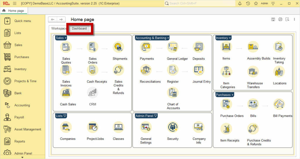
Creating a dashboard #
- Navigate to the Dashboard tab
- From the AccountingSuite Home page, go to the Dashboard tab
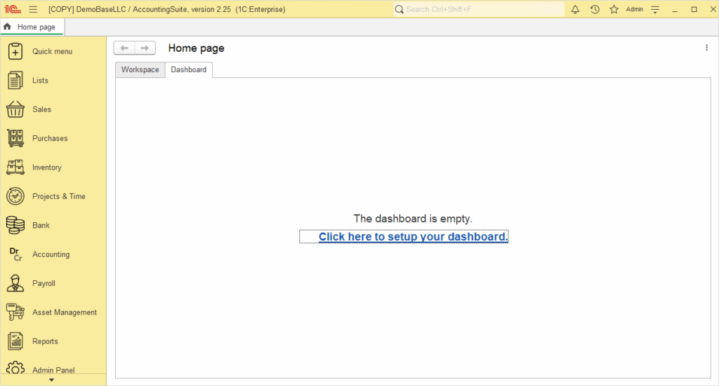
- Click Click here to set up your dashboard
- If you are accessing the Dashboard for the first time, you will see the prompt Click here to set up your dashboard. Click it to begin the setup.
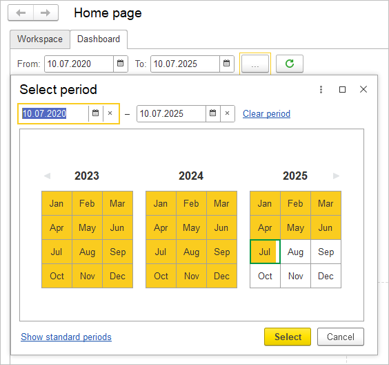
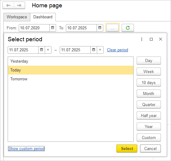
- Select the Period
- Choose the time period for which you want the data to be displayed. This will determine the scope of the data shown in your widgets and charts.
- By clicking the plus (+) button on the Dashboard screen, it is possible to add a new Chart, depending on your needs and focus.
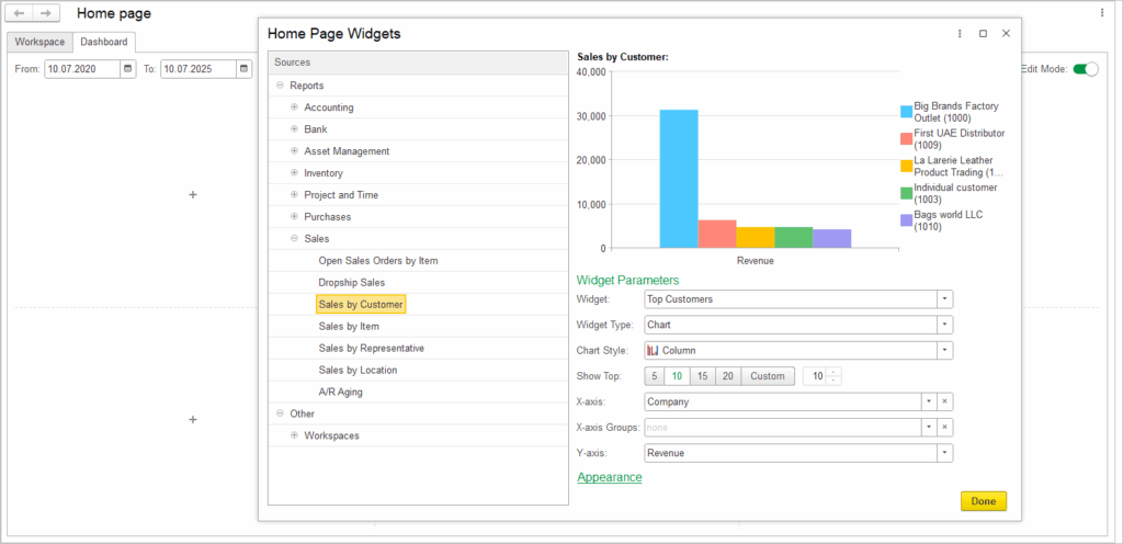
- A double-click on any indicator within the X-axis or Y-axis groups opens a new screen displaying detailed information related to the selected item.
- To manually adjust the size of a widget, click on it and move your mouse pointer to the edge. When the resize cursor appears, click and drag to modify the display size as needed. If you want to reset to the default size, click on Menu → Window → Reset Sizes.
- Once you have finished creating the Dashboard, disable Edit Mode. To make changes later, simply enable Edit Mode again by clicking the corresponding button.
Creating a Workspaces #
- From the AccountingSuite Home page, go to the Dashboard tab and click Click here to set up your dashboard
- Click the plus (+) button to add a widget of your choice.
- Clicking on any document within the widget opens a new screen that presents a list of the documents you have selected.
- To manually adjust the size of a widget, click on it and move your mouse pointer to the edge. When the resize cursor appears, click and drag to modify the display size as needed. If you want to reset to the default size, click on Menu → Window → Reset Sizes.
- Once you have finished creating the Dashboard, disable Edit Mode. To make changes later, simply enable Edit Mode again by clicking the corresponding button.
Editing a dashboard #
Widgets such as Charts and Tables can be visually customized and adjusted to suit specific needs. Users can modify the chart type, choose among various chart styles (e.g., bar, pie, line), and configure how data is grouped and displayed on the X and Y axes. Table layouts can also be adjusted to present information more clearly and effectively. In addition, widget titles and text elements can be edited in terms of content, font, and color, allowing for greater visual coherence and alignment with reporting requirements.
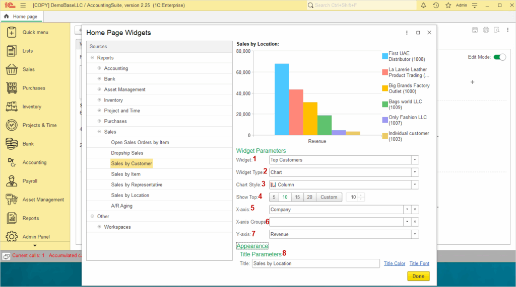
- Widget is a self-contained visual component on a Dashboard that displays specific data or functionality
- Widget type specifies the category or kind of widget, such as chart or table.
- Chart Style determines the visual format used to represent data, such as line, bar, or pie chart.
- Show Top indicates the number of highest-ranking data items to display, such as Top 5, Top 10 or Top 15. Alternatively, you can manually enter a custom number, as long as it is less than 20.
- X-axis represents the horizontal axis on a chart, typically displaying categories
- X-axis Groups allow data points to be grouped along the X axis according to specific categories or attributes.
- Y-axis represents the vertical axis on a chart, used to display numerical values or measurements.
- Title Parameters define how the chart title appears, including the text itself (title), its color (title color), and the font style (title font).
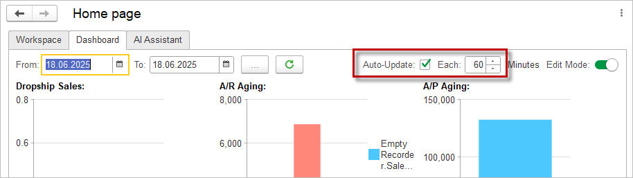
Auto-Update option #
Dashboards include an automatic data refresh option that controls how often the widgets are updated.
- Auto-Update – when this checkbox is selected, the dashboard refreshes its data automatically without user intervention.
- Each [ ] Minutes – in this field, the user specifies the refresh interval in minutes.
- If the Auto-Update checkbox is cleared, the dashboard will not refresh automatically, and the user must update the data manually using the refresh button on the toolbar.